Task progress contrast issue
complete

Vidas
complete
Vidas
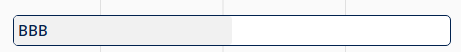
Are you referring to this bar? If so, we will try to optimize colors a bit, but we also need to ensure good text readability and avoid making it too dark on the bar itself.
Olivér Varga
Vidas: Yeah I understand (graphic / UX designer here).
Maybe a solution would be to have a slightly darker stroke between the two areas. That way it doesn't have to be filled with a darker color, but would show the progress better.